
Two releases ago, Fedora 21 introduced its namesake project's "Fedora Next" plan. The goal was simple—bring the massive, sprawling entity that is Fedora into some neatly organized categories that would clearly define the project's aims. And since Next launched, Fedora has been busy doing just that. The results are impressive, and it feels like the distro has found a renewed sense of purpose.
Fedora Next's structure is like a series of concentric rings where each ring is supported by the one inside it. At the center are the core components of the system, APIs that applications hook into, and so on. On the outside are the visible layers that users interact with, what Fedora calls "Environments."For the recently unveiled Fedora 23, these Environments consist of Workstation (Desktop), Server, and Cloud. It's the same Environment trio that Fedora offered in its two prior releases. While Cloud still has the feel of an also-ran, the Workstation and Server releases see quite a few new packages. That's especially true for the GNOME-based Workstation, and luckily the changes are largely welcome.
Fedora 23 Workstation
The biggest change in Fedora 23's default Workstation release comes in the form of GNOME 3.18. But before you get to enjoy what's new in GNOME 3.18, you have to get Fedora installed and do whatever you have to in order to make it through the dreaded Anaconda, Fedora's installation program.
In the Fedora 21 review, I gave Anaconda a hard time. Its button-based approach felt clunky compared to similar offerings from other distros, and sadly most of those criticisms stand with Fedora 23. For example, it still takes an extra click of the button to create a user account on the desktop when everyone installing Fedora 23 Workstation will need an account—why not just present a screen to create one?

Two things in Fedora 23 make Anaconda a bit more tolerable, though. First, it's better at guessing defaults. For example, it successfully set my timezone and keyboard preferences with no user input at all. (That's one win for the button-based approach since there was no need to click those buttons.) Provided you stick with single partition, the default disk partitioning setup in Fedora 23 also may not require much input on your part. The second change that makes Anaconda a bit better this time is a new orange bar across the bottom, which helps call your attention to any unfinished business you may have in the installer. For example, it happily notified me when I needed to create that user account.
It's a marginal improvement over past releases, but ultimately I stand by my assessment. The best you can say about Fedora's installer is that you only have to use it once.
GNOME 3.18
Once you get past Anaconda, Fedora 23 will land you in what might well be one of the nicest, and certainly one of the newest, GNOME desktops around.
Fedora 23 ships with the just-released GNOME 3.18, which is one of the best GNOME releases to date. It offers dozens of new features, better Wayland support, and a new option to update your firmware through GNOME software. But as all GNOME releases seem to, even GNOME 3.18 has a few steps backward.
The first thing you'll likely notice when you set up Fedora 23 Workstation is the new Google Drive integration in GNOME 3.18. Google Drive joins Facebook and Microsoft in the GNOME online accounts panel (along with what I like to hope is the more popular option for Linux users, ownCloud). The new Google Drive support finally makes all your Google documents into first class citizens on the GNOME desktop.

To set up Drive, all you need to do is follow the prompts to sign in to Google and authorize GNOME to access your account. In about 10 seconds, you'll have complete access to everything in your Drive within the GNOME Files app (aka, Nautilus). Your Google Drive account is displayed as a network share in the file browser sidebar, and interacting with your Google Drive documents is no different from local documents. You can set your documents to open in any application you like (by default they'll open in the Web editor), and creating new files and folders in Drive is just like it is for ordinary drives. Like the ownCloud integration, Google Drive in GNOME just works.
There's still no Google Drive client for Linux. For GNOME users anyway, GNOME's integration is good enough that you won't miss it. And if you're not a Google Drive user, the upside is that now that Drive support is done perhaps the GNOME team can move on to integrating other online sync services.
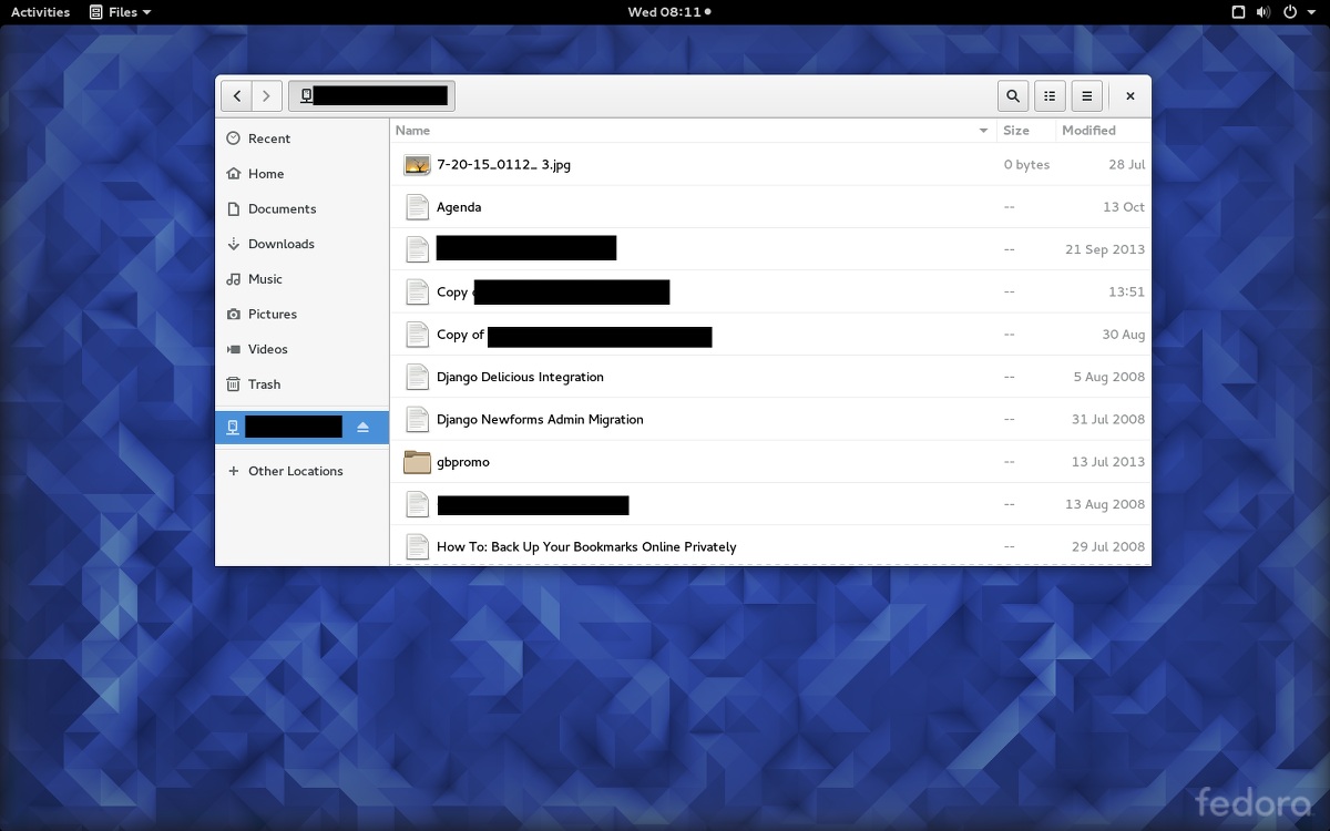
Support for Drive isn't the only thing new in the Files app, although it is the only thing that's new and good. The other change, while relatively minor, is yet another step backward for usability in GNOME. The file copy dialog has been moved to a tiny icon at the top right of the file browser window. An indicator circle animates large file copy operations, and clicking the icon reveals more details and a dropdown that looks roughly like the file copy dialog you'd see in most other applications. It works quite well enough if you know it's there. Otherwise, well, good luck finding any feedback on what your machine is doing when you drag and drop files.
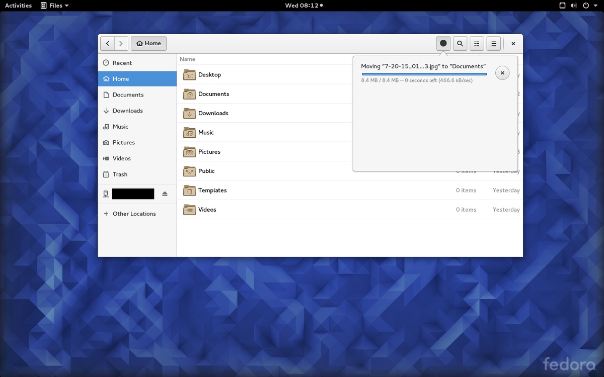
If you're backing up, say, your photo folder with many gigabytes of data to an external drive, you might accidentally copy it three or perhaps even four times before you realize it. Despite the total absence of feedback, something is in fact happening. Don't ask me how I found out, just know that you will not suffer the same because now you know—look for the tiny icon. At least GNOME is getting closer to its goal of making the command line look downright discoverable.
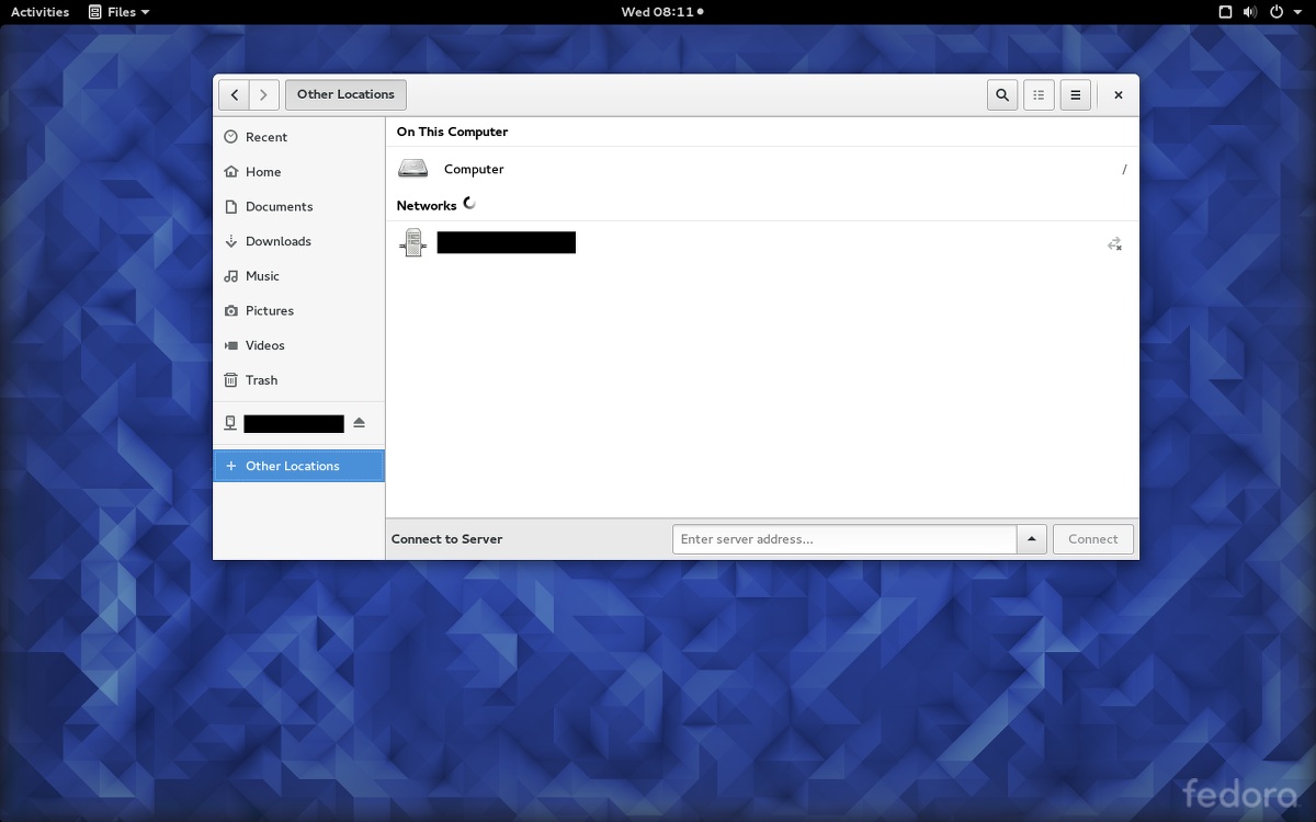
This release will also send you hunting for your network drives since those no longer appear in the sidebar by default. In the words of GNOME's announcement, this was done to "reduce clutter." But those drives now require an extra click on the new "Other Locations" menu item, which will reveal all that unsightly clutter should you actually need to access those cluttered drives.
reader comments
161